Responsive Website Designs: Here’s What You Need To Know!
Finding good web design services should be the topmost priority of a website owner, if they want to create an excellent first impression in the audience’s minds. This impression will decide if they would continue to search through your website or they would back out.
The two primary website designs are responsive and adaptive, and we will discuss responsive website designs.
What Is Responsive Website Design?
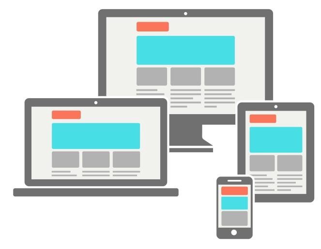
The approach suggests that the website should be user responsive based on their behavior and irrespective of their screen size and orientation. A responsive website would function flawlessly in any screen size, be it of a mobile, or a laptop, or any other viewing device.
If the web design services build your page in a basic manner as it were back in the 90s where there was a fixed screen size that is of the monitor because that was the only choice available then, the website would be fit to run in only one fixed device while it won’t function effectively in other devices. This will hamper the number of visitors visiting the website.
If you are wondering the meaning of the word “responsive,” the website’s responsiveness defines the ability of the website to adapt to the browser’s viewport automatically. In other words, the ability of the website to shrink on mobile and expand on desktop.
The responsive website designs comprise of specific technical details, which are –
- Flexible layouts and grid system – Earlier, when the internet was not there, print determined what size of the content would be displayed. Now websites are defined in terms of pixel sizes. But for responsive sites, one saw that using relative sizes was more effective than using absolute measures.
- Media Queries – Flexible layout is not enough for optimizing the designs for multiple screens. Media queries allow the developers to create condition checks for adjusting the website design. There are numerous breakpoints to define a series of CSS commands. With time, you can predict the breakpoints based on each device’s screen resolution.
- Flexible images and videos – With changing viewports, the images and videos should be scalable too to adjust and fit into the given space.
Fluid images can be handled easily using the CSS command :
- img{ max-width : 100%; }
This command defines the image as 100% resolution and scales itself according to the screen size. This prevents the degradation of the image, which happens when the image gets stretched if the screen size is bigger than that of the image.
Lastly, we will talk about the significant elements of a well-developed responsive website-
- Being consistent – The one thing that would increase your bounce rate and page abandonment in masses is providing an inconsistent web page experience.
- Ensuring compatibility – A developer should prioritize making designs that would be easily accessible.
- Applying Whitespace – Adequate and correctly placed white space would make the reading experience a comfortable one for the users.
Conclusion!
Now that you know about responsive websites to implement them in your small business website, we suggest you take help from experienced web design services who would make things less complicated and much easier for you.